Views and index
Views describe what information (which fields) is shown in search results (search views), on cards (card views), in tables (table views) and in related information lists (list views). All views are stored in the database in the sys_data table.
Lime CRM uses Elastic Search to allow for a global search feature, that makes it possible to search for all indexed information in the application from one place. The search index needs to be created before working in the web client, to be able to search for any information.
Search index
To fully create a search index run limefu search index --application <LIME application name>.
Note!
The time it takes for creating the index depends directly on the number of rows in the database - the more information, the longer it takes to create the index.
Update search index
On-premise
If a search index need to be updated for a whole application (for example after a server upgrade), use the following command:
limefu search index --application <LIME application name>.
Sometimes certain limetypes makes sense to exclude from indexing. For instance limetypes containing large amount of limeobjects that are not relevant for searches but takes a very long time to index. Example of that can be participant.
To exclude limetypes, add these lines to the “config.yml” configuration before you start the indexing:
search:
  exclude_limetypes:
    - participant
Note!
If you don't have a config file you can create a new “application_config.yaml” at this location “C:\ProgramData\Lundalogik\LIME Pro Server” and insert these lines:
<database name>:
  config:
    search:
      exclude_limetypes:
        - <row to be excluded>
        - <row to be excluded>
Note!
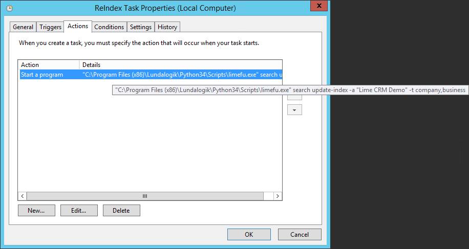
If there is a direct integration to Lime CRM, remember to schedule a partial search re-index task for the relevant types via Windows Task Scheduler!
Cloud
Reindex the database in the cloud environment by accessing your application on the Cloud admin page. You trigger the reindexing via “Actions” and “Reindex”. This needs to be done when you've added a new table in LISA and want to access it in the webclient and be able to search for objects.

Deleting search index (on-premise)
If you are experiencing strange search behaviour in a Lime CRM solution, the application probably has multiple search indices (see note below “how to fully create search index”). In that case you need to follow these steps:
- Run
limefu search list-indexesto list all the indexes. - Delete the indices without aliases, by running
limefu search delete-index -x <index name> --forcefor each index that should be deleted. - Fully create a new index.
Search results
When searching in the web client, the results are boosted depending on:
- Table labels
- Field labels
This means that a match in the search query on a table with a table label and in a field with a field label is more likely to get a higher boost, and be presented higher in the search result list.
The following field types are possible to search for in the web client:
- text fields
- option fields
- relation fields (see below for more information regarding this)
Note!
There must exist a search view for each limetype that should be searchable (see below). No search view = no search result.
Related information - descriptive
It is possible to search for information in related objects. If, for instance, a person is connected to the company “Lime Technologies”. That person is now part of the result for the query “Lime Technologies”.
This is accomplished by adding an attribute, “descriptive”, for relation fields. It is not possible to configure what text the descriptive attribute contains. It will take the value of the field that has a field label that matches one of the following in order (if no field with one of these labels are found, the id of the related object will be used).
- name
- firstname
- lastname
- nickname
- description
- customernumber
- companynumber
- key
- primaryemailaddress
- businesstelephonenumber
- mobiletelephonenumber
- jobtitle
- streetaddress
- city
- category
The descriptive is also shown in relation fields, for example the company name for the link to company on the person object.
Views
Creating default views
On-premise
Issue the following limefu command for creating new views:
limefu view generate --application <LIME application name>
Example:
limefu view generate --application "Lundalogik CRM"
To overwrite existing views, also specify the --override switch. The --override function can be used if you want to regenerate the views from scratch.
If you only want to create views for a specific limetype and for a specific view type, you can issue the following command:
limefu view generate --application "Lime CRM" --viewtypes "card, list" --limetypes "company, person"
The command above will only create list and card views for the company and person limetypes.
Note!
You need to write text strings inside quotes, for example "company, person".
Note 2!
You should only create search views for the limetypes that the customer would like to search for in the global search. Please read more about this here.
Cloud
Regenerating views in the webclient is done on the Cloud admin page under “Actions” and “Regenerate views”.

However, it's important to note that it's only possible to generate for all limetypes and viewtypes at once, i.e. not possible to select a specific limetype or viewtype.
View editor
All views are administrated through the Lime Administrator page, which is available for administrators through the profile button in the upper right corner of the web client.
In the administrators page, press “Views” on the left side of the page in the “CRM configuration” category. Here you can choose limetype (for example “Company”) and view type (for example “Card”). When selecting the view you want to edit, the form will show in the middle of the page.
When finished editing the view, you press “Save”.
Keep in mind
In case your saved views configuration contains validation errors in several forms you need to fix them by switching to the json code editor on the level that contains all errors. Example: You save a form and get the validation message that there are errors in the card and table views of business, so you can't fix both errors in the same form. Click on “Business” and switch the “Show code editor” toggle in the right top corner. Here you'll find the json configuration for all view types of business and can therefore fix both errors.
Note!
To be able to create a new object via the header menu the object needs to be added as a Creatable limetype.
Card views
The card view defines the layout of the fields on the object page, from top to bottom in the details pane and from top to bottom for the related objects pane. Each property describes the field to be shown on the card and if the property has a certain configuration (read-only for example) and if it placed under a specific section.
The view consists of three different parts - Header, Sections and Relations.
Header
Describes the fields that should be visible in the top left of the object page, next to the object icon.
Sections
Describes which fields that should be shown in the details section, from top to bottom.
Separators are defined with Title, for example “title”: “Business info” will create a separator named “Business info”. The first section will always be shown directly without a separator.
Fields are added in the view by adding the corresponding field in the Controls part of the view.
Relations
Related limetypes are described through the database name of the related objects under the Relations part of the config.
Example
Here is an example of a card view for the Business limetype.

This will result in the following card layout:

JSON format
You won't usually need to edit json, but here is the underlying json for the example from above
{
  "header": [
    {
      "property": "name"
    }
  ],
  "sections": [
    {
      "title": "untitled",
      "collapsible": false,
      "controls": [
        {
          "property": "name",
          "required": true
        },
        {
          "property": "company"
        },
        {
          "property": "person",
          "readonly": true
        },
        {
          "property": "coworker"
        },
        {
          "property": "businesstatus"
        },
        {
          "property": "businessvalue"
        },
        {
          "property": "probability",
          "step": 20
        },
        {
          "property": "weightedvalue"
        },
        {
          "property": "wonlostreason"
        }
      ]
    },
    {
      "title": "Important dates",
      "collapsible": true,
      "controls": [
        {
          "property": "quotesent"
        },
        {
          "property": "expecteddate"
        },
        {
          "property": "closeddate"
        }
      ]
    }
  ],
  "relations": [
    {
      "property": "document"
    },
    {
      "property": "todo"
    },
    {
      "property": "history"
    }
  ]
}
Option queries
Control specific configuration
Percentage field slider options
Percentage fields are controlled by a slider that can be customized in two ways - with or without steps. When the step option is used, it’s possible to choose the interval value which the slider will snap to.
The default behavior without any specified option is to use no steps, meaning that the slider will be able to take every value from 0 - 100.
To use the step option in the probability field we would write:
        {
          "property": "probability",
          "step": 20
        },
This would result in the slider snapping to every 20th value at the slider from 0:
0 - 20 - 40 - 60 - 80 - 100

Read-only controls
It's possible to set specific fields as read-only in the web client only. This is done in the card views by adding the readonly-syntax below after the property.
        {
          "property": "person",
          "readonly": true
        },
Required controls
It's possible to set specific fields as required in the web client only. This is done in the card views by adding the required-syntax below after the property. If a field is required and empty, you won't be able to save the card (the “Save” button is grey).
        {
          "property": "name",
          "required": true
        },
Date formatting
It's possible to format date properties by adding a format config in the following way:
        {
          "property": "expecteddate",
          "format": "quarter"
        },
The config above will format the field “Expected date” as a quarter-picker instead of a regular date field.
The following date formats are available.
yearquartermonthweekdatedatetimetime
Old card view format
The view consists of three different sections. For each section, you write the database name of the fields in brackets (for example [[name]]) that you want to show from top to bottom.
==== Title ====
Describes the fields that should be visible in the top left of the object page, next to the object icon.
=== Main ===
Describes which fields that should be shown in the details section, from top to bottom.
Separators are defined with ==, for example == Adresses == will create a separator named “Adresses”.
If you would like to hide a specific field on the card, you can use #. The code below will hide the Phone-field.
#[[phone]]
=== Relation Collections ===
Related objects are described through the database name of the related objects under the headline === Relation Collections ===.
Note!
Relations to to-dos are excepted from this, and are included automatically if the object has a relation to to-dos.
Example
Below is an example of the layout of the company card view.

The view above results in the following layout:

Note!
If you are about to hide an object in the web client you need to delete all content in the objects card in the View editor. You also need to delete all content in the search view and all relations to that object in the other cards.
Note!
If fields are added/removed from the database (through LISA/MAGGIE), the same fields needs to be added/removed for the corresponding views in order for the web client to work properly.
Control specific configuration
Percentage field slider options
Percentage fields are controlled by a slider that can be customized in two ways - with or without steps. When the step option is used, it’s possible to choose the interval value which the slider will snap to.
The default behavior without any specified option is to use no steps, meaning that the slider will be able to take every value from 0 - 100.
To use the step option in the probability field we would write:
[[probability]] view(step=20)
This would result in the slider snapping to every 20th value at the slider from 0:
0 - 20 - 40 - 60 - 80 - 100
Read-only controls
It's possible to set specific fields as read-only in the web client only. This is done in the card views by adding the syntax below right to the fieldname.
[[fieldname]] view(readonly)
List views
The list views describe what information is shown in related object lists, for example what information is shown when pressing the Person-related list on a company object page. See image below.

The view consists of two different parts - Header and Subheader.
Header
Describes what fields should be visible on the first row for each object in the list. The fields shown on the first row has a larger font compared to the second row and should be used to highlight important information.
Subheader
Describes what fields should be visible on the second row of object.
Example
Here is an example of a person list view:

This will result in the following list layout:

JSON format
You won't usually need to edit json, but here is the underlying json for the example from above.
{
  "header": [
    {
      "property": "name"
    },
    {
      "property": "position"
    }
  ],
  "subheader": [
    {
      "property": "email"
    },
    {
      "property": "phone"
    }
  ]
}
Old card view format
The list views are per default copied from the search views. This means that the exact same information shown in search views are shown in all list views. However, this is configurable by going to the list view for the specific limetype.
The view consists of two different sections. For each section, you write the database name of the fields in brackets (for example [[name]]) that you want to show from top to bottom.
== title ==
Describes what fields should be visible on the first row for each object in the list. The fields shown on the first row has a larger font compared to the second row and should be used to highlight important information.
== properties ==
Describes what fields should be visible on the second row of object.
Example
The example below illustrates the list view for person.

The list view configured as the example above results in the following list view for person:
Search views
The search views describe what information is shown in search results. If the customer does not want some specific limetypes to be searchable, those search views needs to be deleted by simply selecting everything in the text box and erasing the content and thereafter save.
The view consists of two different parts - Header and Subheader.
Header
Describes what fields should be visible on the first row of the search results. The fields shown on the first row has a larger font compared to the second row and should be used to highlight important information when looking at the search results.
Subheader
Describes what fields should be visible on the second row of the search results.
Example
Here is an example of a company search view:

This will result in the following list layout:

JSON format
You won't usually need to edit json, but here is the underlying json for the example from above.
{
  "header": [
    {
      "property": "name"
    },
    {
      "property": "coworker"
    }
  ],
  "subheader": [
    {
      "property": "postaladdress1"
    },
    {
      "property": "postalcity"
    },
    {
      "property": "country"
    },
    {
      "property": "phone"
    },
    {
      "property": "www"
    },
    {
      "property": "registrationno"
    }
  ]
}
Old card view format
The view consists of two different sections. For each section, you write the database name of the fields in brackets (for example [[name]]) that you want to show from left to right.
== title ==
Describes what fields should be visible on the first row of the search results. The fields shown on the first row has a larger font compared to the second row and should be used to highlight important information when looking at the search results.
== properties ==
Describes what fields should be visible on the second row of the search results.
Example
Below is an example of the layout of the company search view.

The search view for company, configured as the one above will give the following result in the search results.
Table views
The table views describe what information is shown in the tables for each limetype in the web client. It is possible to go to the table for a specific limetype through the table icon in the header of the application. It is also possible to go to table for a specific set of records of a limetype from the icon on the related view, for example go to the table to show all persons for a specific company.
The table views are generated per default from the structure of the database, listing all fields in the table from left to right in the table view.
Note!
At the moment it is NOT possible to list Map fields or any fields with SQL expressions in the table view.
For each column in the view, you define:
property- the database name of the field that you want to show in the table view.
isDefault- set totrueorfalseto define if the field should be included in the default view or not.
It is possible to enable/disable the table view for a specific limetype by changing:
enabledtotrueorfalse.
Example
Here is an example of a participant table view:

This will result in the following list layout:

JSON format
You won't usually need to edit json, but here is the underlying json for the example from above.

XML format for older Lime CRM versions
The view is described in a xml-format, where each row describe the field in the database to be shown in the table, from left to right. For each row, you define:
- How the data is formatted, for example
lime-stringwill format the data as plain text. The different formats are listed below:lime-stringlime-numberlime-optionlime-yesnolime-linklime-datetimelime-belongstolime-phonelime-progress(used to show decimal fields as a progress bar, for example “Probability” for a Deal)
- Which data (which field in the database) that is shown, for example
property=“firstname”.
It is possible to enable/disable the table view for a specific limetype by changing
<view enabled=“1”>to0or1.
If you would like to set the table view to the default setting, it is possible to delete the complete view and save. The view will then be regenerated as the default view, but set as disabled
<view enabled=“0”>.
It is also possible to configure what columns in the table view should be in the default view by the isDefault property. isDefault = “1” means that the column is part of the default view.
Note!
Only the rows in the configuration can be selected in the table view. That means that if you do not want the users to be able to select a specific column to be shown in the view, that row needs to be removed from the table view configuration.
Example
Below is an example of the layout of the participant table view.

The table view for person, configured as the one above will give the following result in the table for person.

My view
It is possible for users to set up their individual view, “My view” and switch between this one and the default view by pressing the “View” icon in the upper right corner.
When setting up “My view”, the user can only select the columns that are available in the table view configuration in Lime Administration.

Note!
“My view” is stored locally in the browser cache. That means that the user will not have the same “My view” if they switch browser and/or device.
Older versions of Lime CRM
For older versions of Lime CRM - please go here for version specific configuration.